The Context
Auckland's food discovery problem
Auckland's hospitality industry was under post-COVID pressure when Zomato left New Zealand and food discovery basically went dark. Hops was the bet on what could fill that hole, designed for the kind of city Auckland actually is.
Define
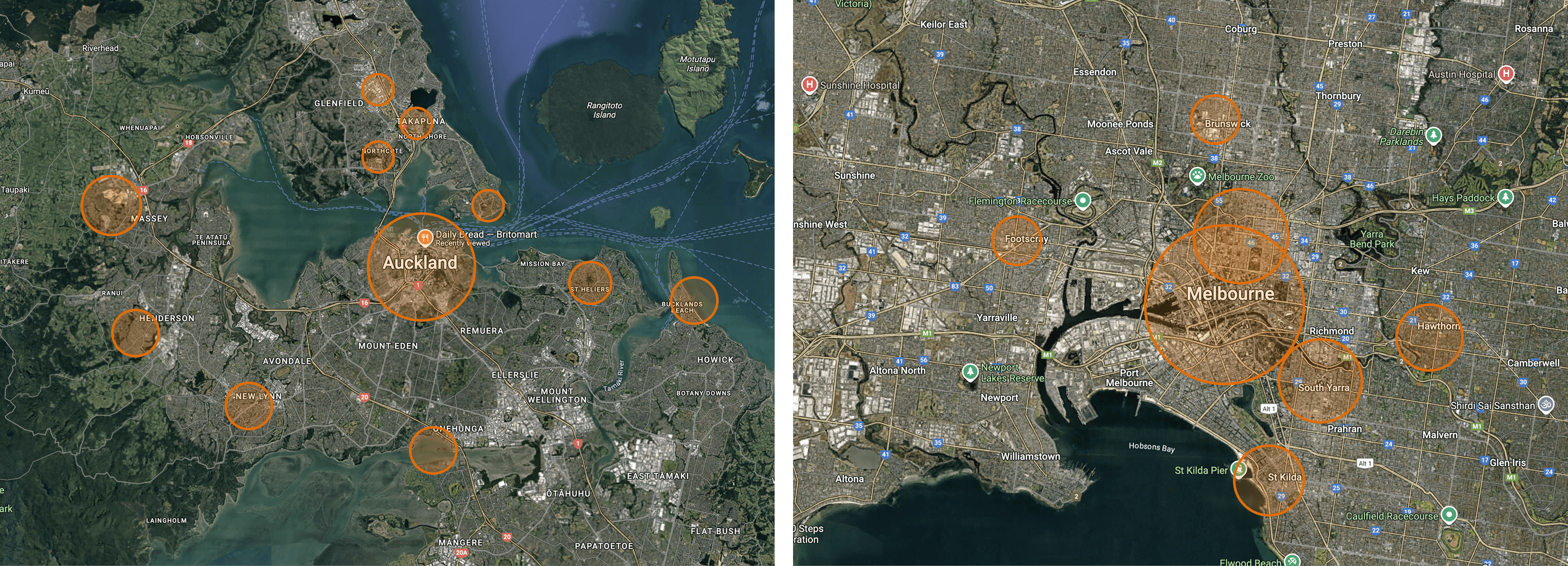
Auckland is built differently
Auckland is polycentric. People stay in their suburb hubs more than they explore. Foodie culture mostly stays invisible: you only know what's good in your neighbourhood. Restaurants outside your radius are basically off the map until someone tells you.
Hypothesis
“If we built deal discovery around neighbourhoods first, casual diners would find more places they'd actually go to, and restaurants would reach the people most likely to walk in.”
Design
Key Features
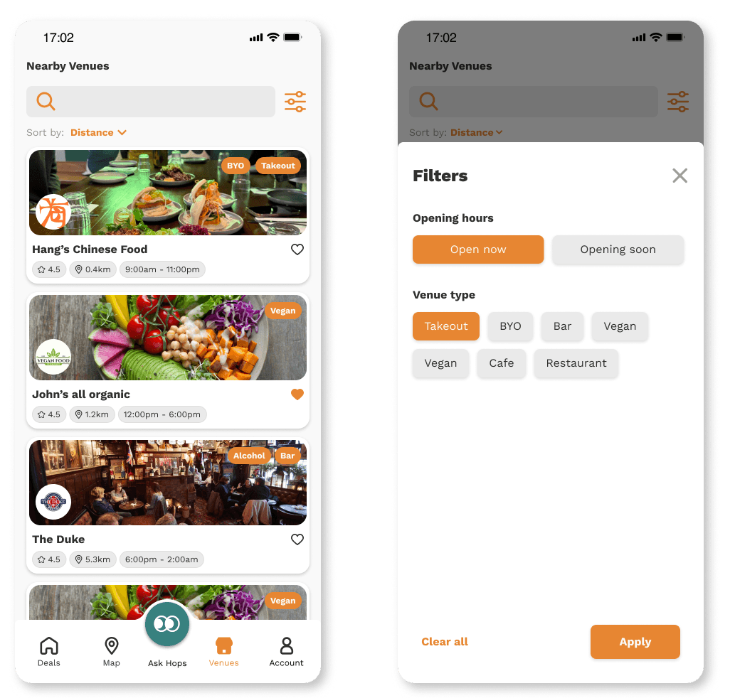
Home Dashboard
Designed around the first decision users make: what's worth leaving the house for right now. Everything you need to make that call sits on one surface, no app-hopping.
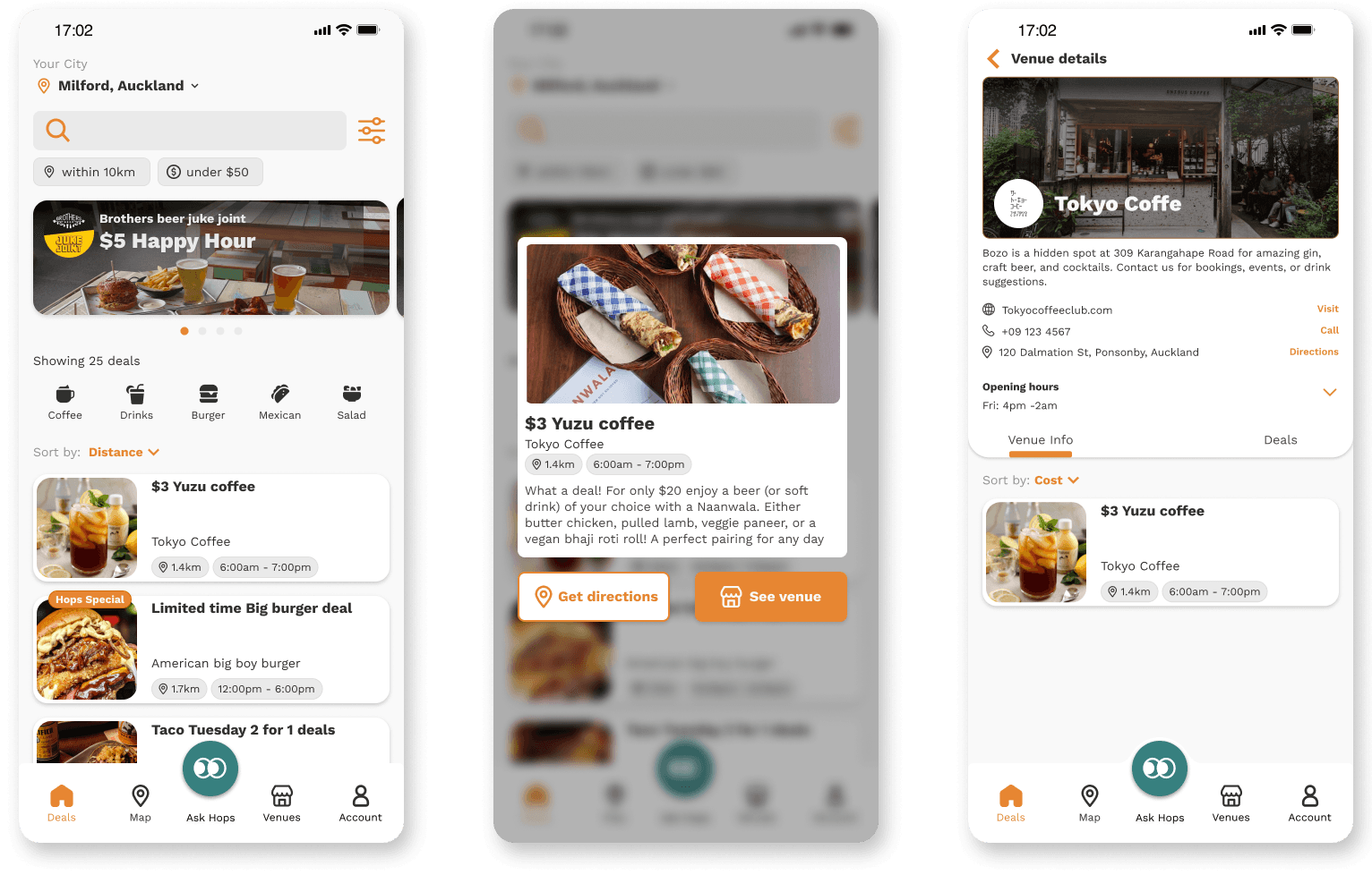
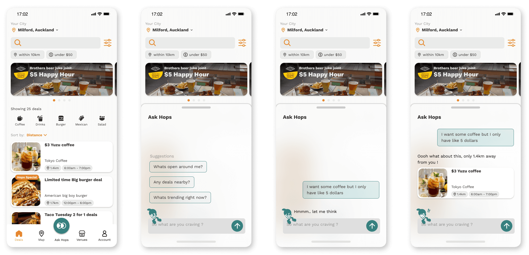
Your foodie friend Hops
Indecision is what kills most food apps for casual users. So I made the brand voice a foodie friend, someone who nudges you instead of making you scroll.
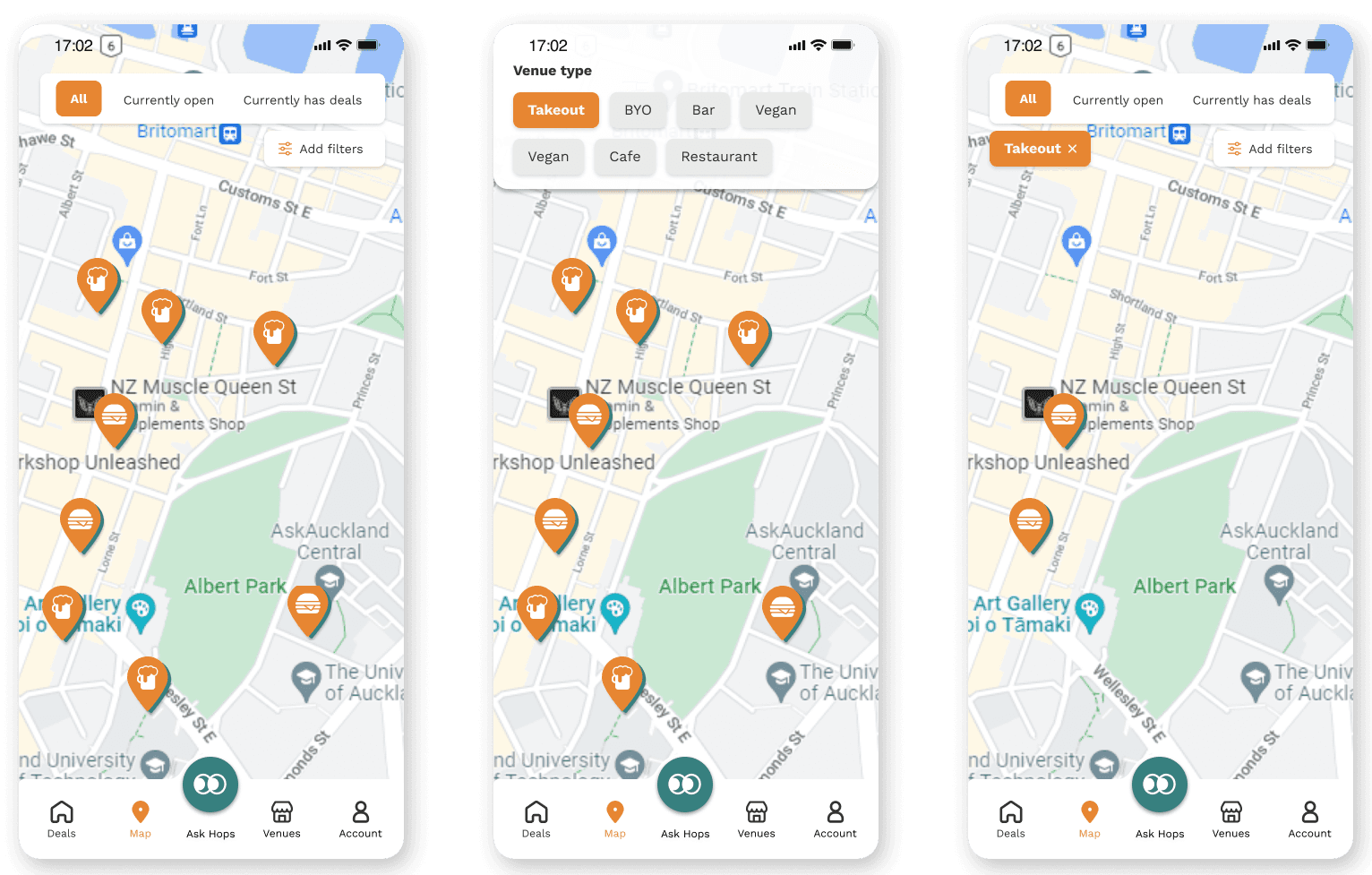
Map page
Because Auckland is spread across neighbourhood hubs, location mattered as much as the deal. The map made nearby options visible and let users compare what was realistically within reach.
Saving your favourites
Favourites turned one-off discovery into an ongoing habit. Users could mark places they wanted to try, so the next decision wasn't from scratch.
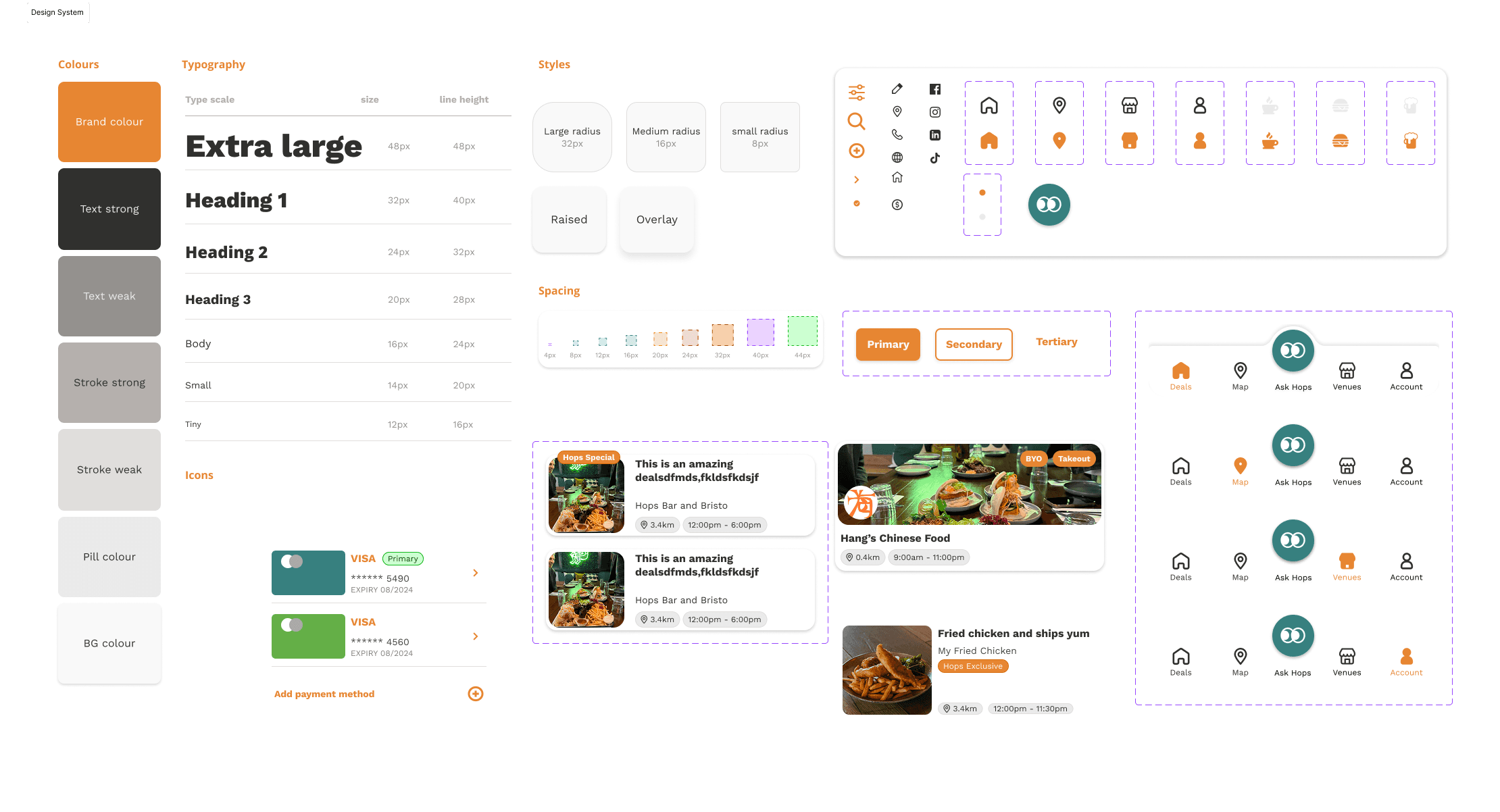
Our design system
I built the Hops design system alongside the flows. The foodie-friend tone had to carry through every component, not just the marketing copy.
Testing
Meeting our users on the street
After launching the MVP, I ran guerrilla testing during Auckland University's O-Week. We wanted to see whether the polycentric bet held: did students see Hops as a way to actually go to new places?
The interest was real
74% said they'd consider using Hops. Only 52% said they'd actually change their behaviour and head to the CBD more. The gap is the story.
The blocker isn't the app
Students kept coming back to transport and safety: the friction of getting to a place after deciding to go. The discovery problem had a service design problem underneath.
Beyond the screen
Bigger than a deal app
What we thought was a discovery problem turned out to have a deeper one underneath. Hops is now exploring how to mitigate the things that block someone from acting on a deal: transport, safety, the bits of city life that live outside the app.
Reflections
Reflections
City-aware design
The polycentric insight was the foundation, not a footnote. Designing for the way Auckland actually works, instead of borrowing a US grid template, is the kind of thinking I want to do more of.
Co-founding teaches you scope
Co-founding meant making calls that crossed brand, product, and service. There's no waiting for someone else to define the thing. You define it, design it, watch it break in testing, then redesign.
Service design over screen design
Hops taught me the interesting design problems often live one layer deeper than the screens. Transport, safety, infrastructure: those are also design surfaces, even if they don't have a Figma file.